Turisa editrice

Turisa Editrice è una casa editrice giovane, fondata da un gruppo di amici appassionati di libri e di grandi storie. Il loro obiettivo è quello di realizzare un prodotto innovativo di alto livello grafico-redazionale, che sappia attirare il lettore e soddisfare le sue aspettative.
The Turisa Editrice is a young publishing house, founded by a group of friends and fans of books and great stories. Their goal is to create an innovative product of high graphic-editorial level able to attract the readers and meet their expectations.
La richiesta del cliente è stata quella di realizzare un restyling dell’identità visiva e di creare un payoff che sintetizzasse la filosofia della Casa Editrice. Il lavoro è partito dal settore merceologico dell’azienda, quindi mi sono concentrato sul libro, in qualità di oggetto, e sui suoi valori annessi.
The client’s request was to create a new visual identity and a payoff able to synthesize the philosophy of the Publishing House. My work started from the commodity sector of the Company, so I concentrated on the book as an object and its related values.
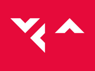
Ho aperto un libro e ho iniziato a riflettere su tutto ciò che significa: conoscenza, novità, emozioni, sentimenti e immaginazione. Poi ho pensato alla filosofia dell’azienda, cioè all’idea del libro come un viaggio che, pagina dopo pagina, lega ad un’altra esistenza, oltre lo spazio e il tempo. Da qui l’intuizione: associare la pagina di un libro al nome Turisa. Così è nata la costruzione geometrica del logo. Ho sezionato una parte di una pagina di un libro e l’ho combinata con la lettera “T”, l’iniziale del nome Turisa.
I opened a book and I started to think about all that means: knowledge, innovation, emotions, feelings and imagination. Then I thought about the philosophy of the Company, that is the idea of a book as a journey that, page after page, connects to another existence, beyond space and time. Here came the intuition: associate the page of a book with the name Turisa. In this way the geometric construction of the logo came to life. I sectioned a part of a page of a book and I combined it with the letter “T”, the initial of the name Turisa.
I colori che ho scelto sono il Rosso e il Nero. Il colore dominante è il Rosso perché indica calore, amore, gioia, passione, energia, ma anche ferocia, martirio, crudeltà, cioè tutto ciò che caratterizza un romanzo di qualsiasi genere. Il Nero assoluto, invece, assorbe tutti i colori, quindi sul piano psicologico rappresenta l’oscurità primordiale e le sensazioni e gli stati d’animo connessi. Inoltre il Nero è il colore dell’eleganza.
Il payoff “Emozioni scritte” nasce dall’idea che un racconto che viene scritto è in grado di creare un legame empatico grazie alle emozioni che riesce a suscitare nel lettore.
The colors I have chosen are Red and Black. The dominant color is Red because it indicates warmth, love, joy, passion, energy, but also ferocity, martyrdom and cruelty, that is all that characterizes a novel of any kind. Whereas the absolute Black absorbs all the colors, so psychologically it represents the primordial darkness and the feelings and states of mind connected. Black is also the color of elegance.
The payoff “written Emotions” came from the idea that a written story is able to create an empathic link by the emotions that can be aroused in the reader.
Concetto.
Concept.

Costruzione del marchio.
Brand contruction.

Declinazioni del marchio, composizione e proporzione.
Declinations of the brand, composition and proportion.


Applicazione del marchio.
Brand application.

Marchio con pay-off.
Pay-off with brand.

Marchio con nome della collana.
Brand with name of the series.

Colori Istituzionali.
Corporate colors.

Coordinato grafico.
Corporate identity.